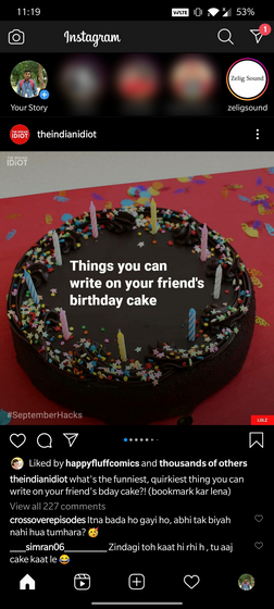
With this change, you will no longer see the search button or ‘Explore’ section in the navigation bar. Instead, Instagram has shifted its position right next to the DM section in the top right corner of the app. The Facebook-owned company hopes to increase the user engagement of Reels with this move. Until now, Reels existed in Explore and Profile sections.
Instagram launched Reels in India after the Indian government banned TikTok in the country. The company was testing Reels in Brazil, France, Germany over the past year and expanded the feature to over 50 countries in August. According to Instagram head Adam Mosseri, Instagram is adding this Reels tab due to the momentum the company is seeing in the country. In a statement to ET, Facebook India’s director and head of partnerships Manish Chopra said Instagram is planning to integrate more tools in the future. “Discovery through reels is driving strong follower growth for creators. Like IGTV, episodic content is surfacing on Reels. New music is finding a place in popular culture, by being available on Reels,” said Chopra. Notably, this is the second popular app tweaking the UX this week. Yesterday, YouTube did a minor change to add a create button in the bottom navigation bar, changing the position of notification and subscription buttons in the process.
