Vivo has been working on OriginOS for close to a year now. It set up Origin Studio to design the new UI experience, which places focus on three core areas – design, smoothness, and convenience. With regards to this, let’s take a closer look at the five best new features in Vivo’s OriginOS skin:
5 New Features in Vivo’s OriginOS
1. Klotski Grid
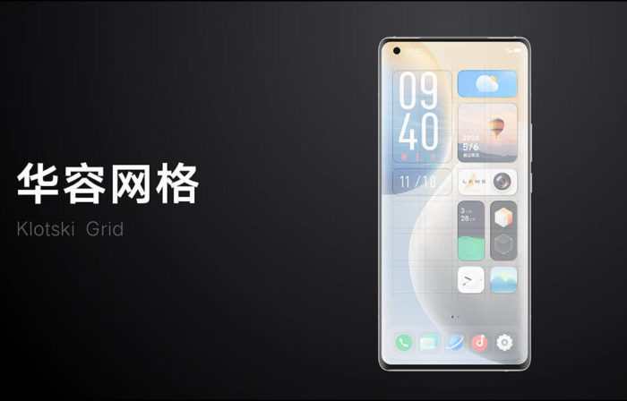
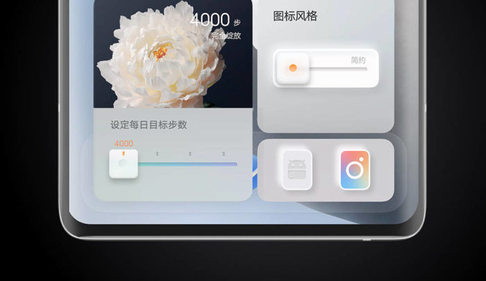
Vivo is adopting a new grid-based design for the home screen with OriginOS. It is based on the Klotski grid, a Japanese puzzle game, and adds flexibility to the UI. You can now choose from a variety of icon shapes (1 x 1, 1 x 2, 2 x 3) and is reminiscent of the Windows 10 start menu grid. The bigger the icon, the more functionality you get out of it.
OriginOS allows you to switch up the home screen design at will. The icons and nano cards look modern, as well as quirky. Vivo no longer bounds you to an icon grid as an Android device does (moving a widget around might mess up the grid). You can mix and match the apps to create a grid of your choice. This functionality feels a lot closer to the latest iOS 14 build and the evolution of the existing icon/ widget grid on Android.
2. Nano Alerts
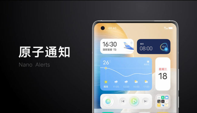
The nano alerts are the icing on the cake for the grid-based design. Vivo now strives to deliver users key information at the right time and this is where nano alerts come into play. OriginOS does not want you to open many apps. Instead, it wants to bring core functionality to the app card on the home screen itself.
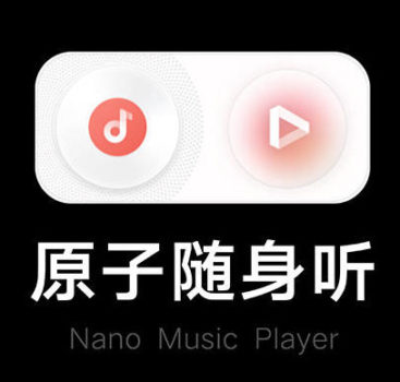
As you can see in the screenshot above, OriginOS will offer you hourly weather alerts, enable you to set alarms or take notes at the touch of a button on the homescreen. The nano music player too has two features – one the ability to pick the music service and second, playback controls right on the home screen.
Further, a long-press on icons can help you access more features, such as any specific lens (telephoto or macro) and video modes in the camera app. This is certainly amazing and will come in handy when you want to capture a moment in a jiffy.
3. Navigation Gestures
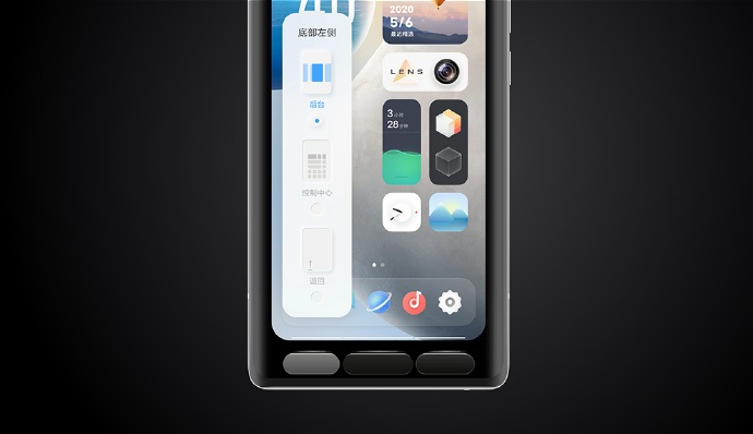
Android might still be struggling to implement navigation gestures, but Vivo has it all figured out. I already liked the gestures on Funtouch OS but the company decided to provide users the option to customize their own navigation experience with OriginOS.
Now, Vivo offers you 26 navigation combinations with OriginOS. You can now pick exactly what happens when you swipe up from the left, right, and center. It even lets you customize the edge gesture to go back and access the card package (more on this below). The user can now set the length where a certain function activates when you swipe in from either edge.
4. Parallel World
As leaked earlier this month, OriginOS offers you a quick toggle to jump between the new grid-based UI or the standard Android-like UI that we have come to know with Funtouch OS over the years. You simply need to tap a button to go from a beautiful grid with nano alerts to a well-known and comfortable experience. All of your data is preserved and accessible in both worlds.
5. OriginOS Card Package
Last but not least, OriginOS also understands our mobile payment behaviors and will present you with your favorite payment options via the Card Package. It is accessible via a swipe from the bottom right edge at all times. The OriginOS Card Package seems to be a redesigned version of the new Android 11 power menu, which integrates your cards for quick payments. Vivo integrates some of the most commonly used apps such as AliPay, WeChat, and more. It allows for one-tap payments simply by scanning your fingerprint, which is easier than entering a PIN. If you are wondering whether your Vivo phone will receive the OriginOS skin or not, then you will have to wait a little while. The company is yet to share an official update timeline and device list, so stay tuned for more information.
