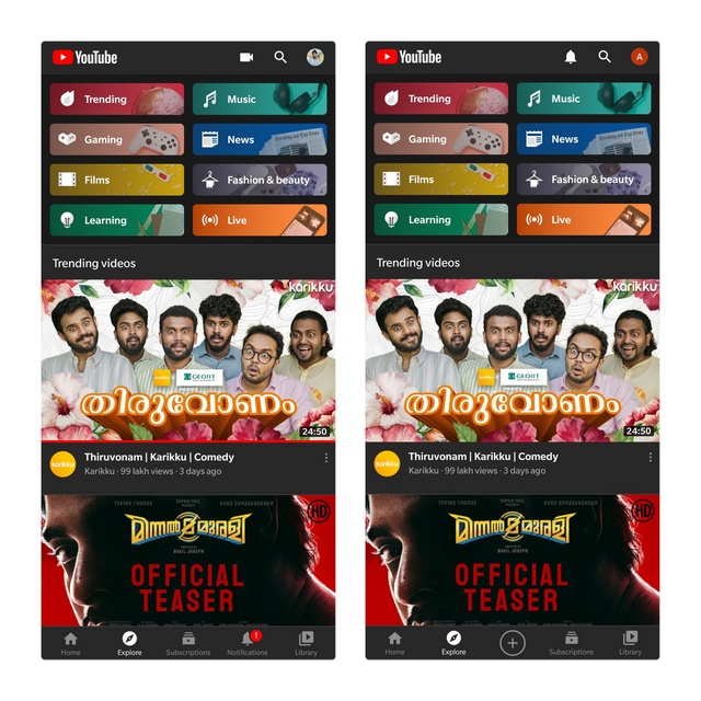
— YouTube India (@YouTubeIndia) September 2, 2020 The company is making this change to make it easier for users to create videos on mobile. You can just tap on the create button to upload new videos or go live in the platform with your audience. To accommodate the create button, YouTube is shifting the position of the subscription and notification buttons. While the subscription button moves to the right, YouTube has entirely shifted the notifications to the top right corner in between cast and search buttons. In other words, notifications button has taken the old position of the create button. Old UI vs New UI The changes are live in one of my Google accounts at the time of writing this article with YouTube version 15.35.41, while I have the old UI in another account. That might be because Google is enabling the feature through a server-side change. Let us know if it is available in your YouTube app in the comments. As 9to5Google points out, YouTube’s sudden interest to emphasize on content creation might be part of its bigger plans to roll out TikTok-like in-app short video service ‘Shorts‘. Going by rumors, YouTube will launch Shorts by the end of the year. Since this is merely a repositioning of buttons, you will not notice any changes in terms of the core functionality. YouTube says it will add create button in the bottom navigation bar on iOS and will globally expand the changes in the future.
